Fleischmann’s Deluxe Type Design and A.-J. Roubo –
 When Chris gave me the design brief to work on the Lost Art Press edition of “L’art du menuisier,” I realized that I had the opportunity to design two editions for two distinct groups of readers. One for the hands-on user in the workshop, and the other would be for readers who might enjoy a book evocative of the time of its creation. These two designs, within the parlance of the Roubo translators group, became known as the Standard and Deluxe editions. As different readers, and different printing techniques, would bring different demands, separate typographic treatments would be used for each edition.
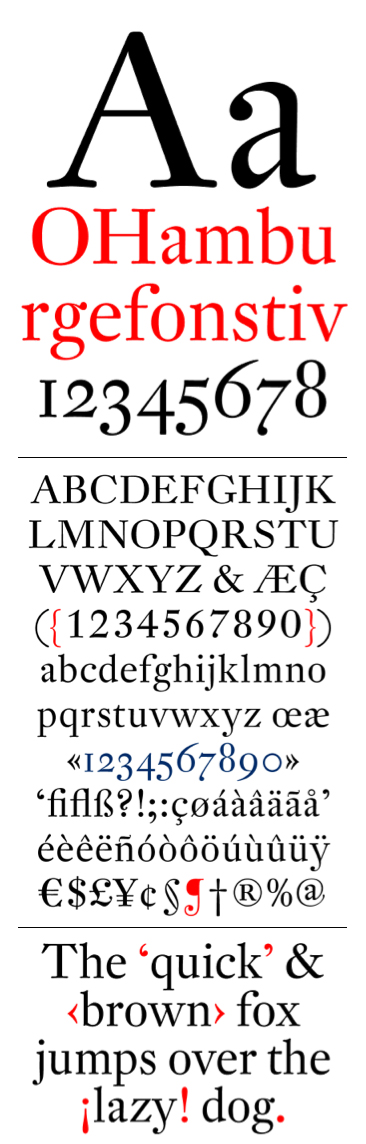
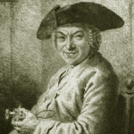
The design of the deluxe edition takes the ambiance of the 18th-century book for its design cues; early 20th-century book designers, most notably Bruce Rogers, termed this “allusive typography.” Hallmarks of the Rococo book include the substitution of type ornament for woodcuts, a rationalized system of titling (breaking the chapters into discrete parts, and giving them subheadings), and the use of Baroque typefaces. Each of these changes marks the progress toward the industrialized production techniques of the 19th-century: the change from hand-press platen to the cylinder press; rationalization of scientific inquiry; a narrowing of the letterforms, together with shorter descenders and a tendency towards a more brilliant style of cutting. This Baroque style in type design marks its beginning with Hungarian Miklós Kis in the 1690s, continues with the French founder Pierre Simon Fournier in the 1740s, and finds its nadir with Johann Michael Fleischmann’s work in the 1760s for the Enschédé Foundry. Furniture makers can find a similar stylistic transition from William & Mary through Federal.
Fleischmann types, finding themselves eclipsed by the modern styles, fell out of fashion and disappeared from use; but for an edition like “To Make as Perfectly as Possible,” his types are perfect. Happily in the early 1990s, the Dutch Type Library was able to find Erhard Kaiser in Leipzig to create the digital drawings using the original copy of Enschédé’s 1768 specimen book.
Types created during the 400 years of printing were entirely cut by hand, letter by letter, and each size was adjusted for its optical size. After the invention of the pantograph, most types were created using only one master set of drawings. This has continued to be largely the case with the current group of digital fonts. A few fonts have been designed with optical scaling in mind: a set of drawings for sizes 12 point and below, known as Text; a Display set for 14 point and above. DTL Fleischmann is one of these. In the deluxe edition of “To Make as Perfectly as Possible,” the footnotes, sidenotes and the editor’s comments on process have were set in the Text version; Roubo’s text and most of the headings were set using the Display set.
As part of the international support for the Roubo project we are grateful to Frank E. Blokland at Dutch Type Library in Amsterdam for loaning us a copy of DTL Fleischmann to use in the design of the Roubo volumes.
— Wesley Tanner
Next: Tending the Typographic Garden.